LAMP(2025) ReVamp 🧛🏾♀️
It's Letterboxd for music.
Ongoing redesign & development of my university capstone to build a fuller, identity-driven music platform.
interaction & graphic designer
fullstack developer
march 2026 - current
Next.js, Vercel, Figma
context
Walkthrough video — originally created as part of a Shopify apprenticeship application (March 2026)
LAMP began as my university capstone project. The first version explored the idea of a music diary platform, but academic deadlines and technical constraints capped how far we could take it.
The itch to revisit it finally hit about a week ago (writing this early March 2026) — I've got more time, creative capacity, and experience in creative programming and interaction design now.
LAMP V2 is an ongoing redesign for exploring identity-driven discovery, playful album interactions, and community-driven listening spaces.
roles
we are a team of two
Sarah Yoon, fellow creative code nerd and bird genius, is the teams lead backend developer and backend specialist.
Daisy Fernandez-Reyes frontend developer & interaction designer (plus graphic design, UI, and everything in between)
current exploration
LAMP V2 is still early, but here's what's taking shape across discovery, interaction, and community.
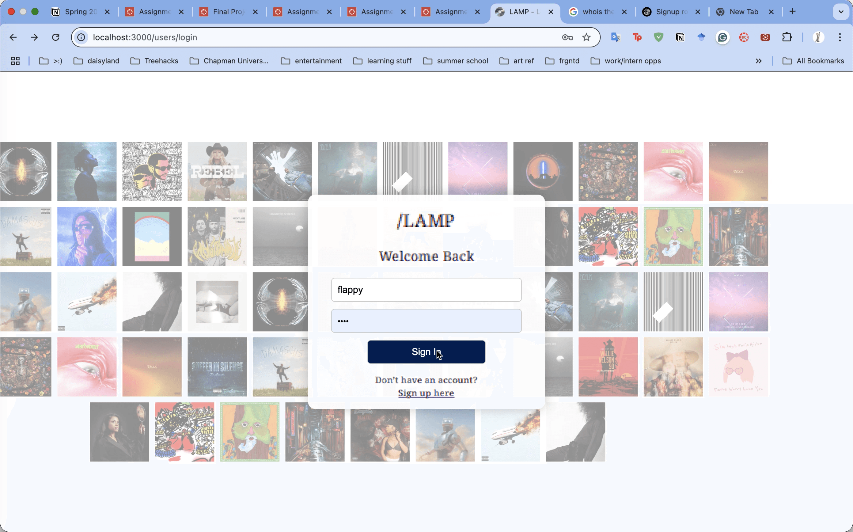
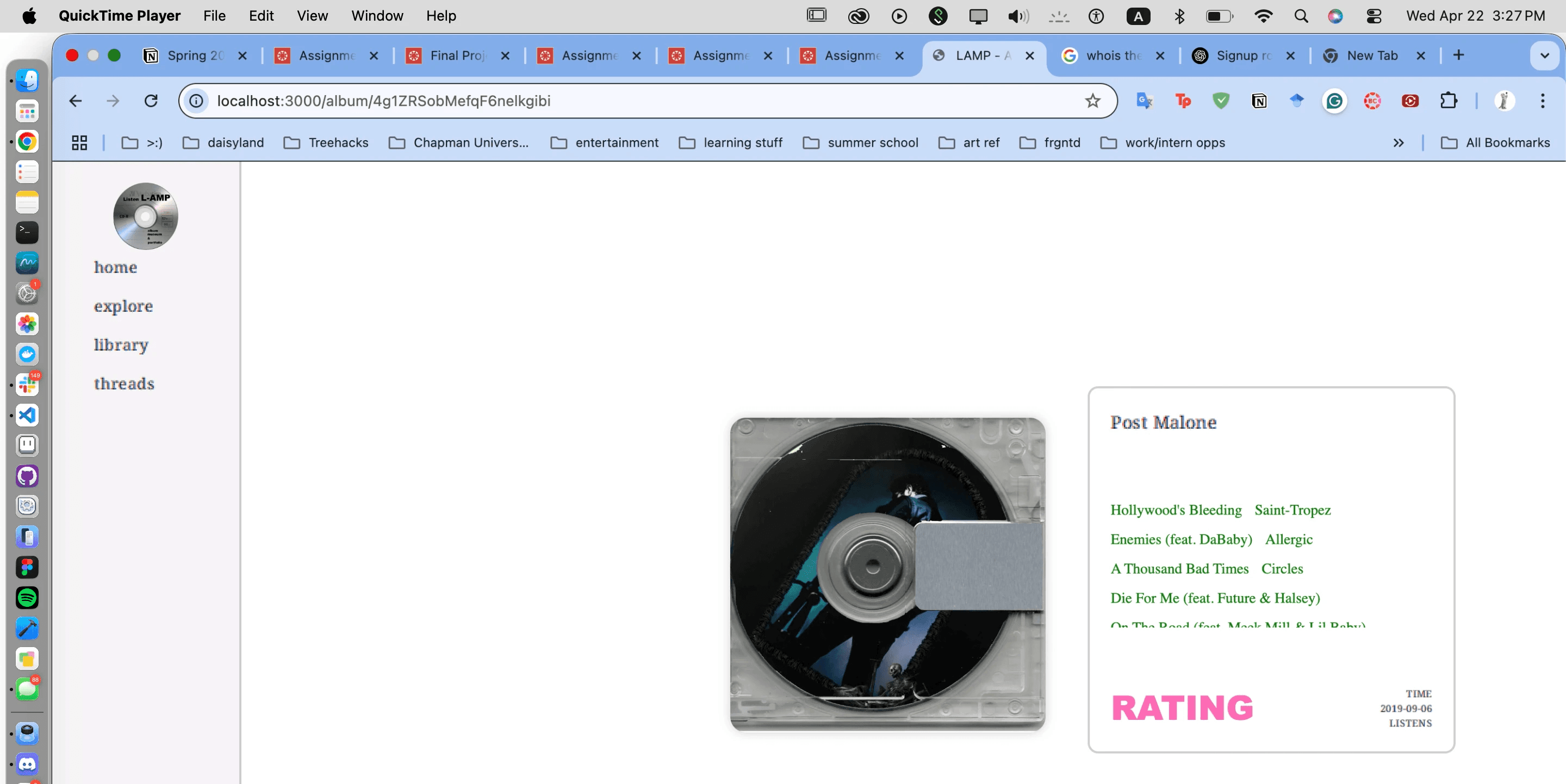
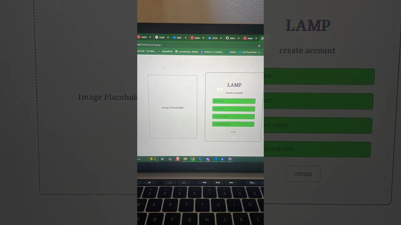
old user sign in screen
(lamp 2025)
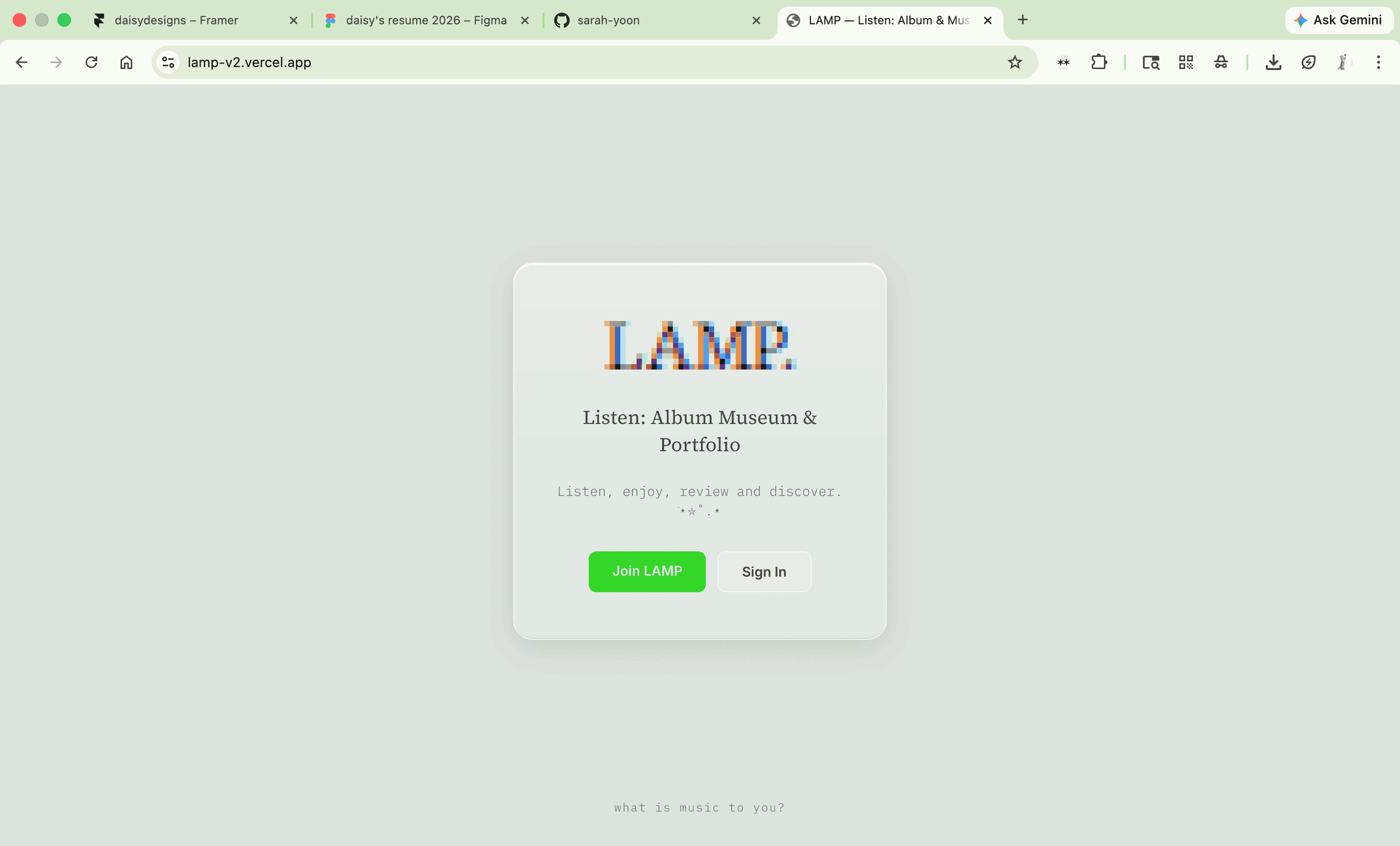
new sign in screen (design in progress)
(lamp. v2, 2026)
Identity-driven discovery
Exploring how a listener's type — Audiophile, Explorer, Critic, Fan — could shape what they find next, instead of relying on algorithmic feeds alone.
Playful album interaction
Testing interaction models — picking through CDs, vinyl, or cassettes — that make revisiting an album feel more like flipping through a collection than scrolling a library.
Community Listening spaces
Rethinking what a comment or review section could feel like for listeners instead of influencers — less hierarchy, more shared reflection.
process
Research & competitive analysis
Looked at how other platforms handle discovery and cataloging — Spotify and Apple Music optimize for streaming and playlists, but lack depth in community or critique. Letterboxd, Are.na, and StoryGraph showed the value of cataloging, reviewing, and reflection instead. That gap shaped the core question: how might we create a platform for listeners — not influencers — to share, reflect, and connect authentically through music?
Listener archetypes
Rather than one-size-fits-all feeds, LAMP is built around four listener types — Audiophile, Explorer, Critic, Fan — each engaging with music differently. These archetypes drive how discovery and interaction are being redesigned for V2.
Interaction models
Early interaction concepts explored album browsing through physical-media metaphors — flipping through CDs, vinyl, cassettes — instead of a scroll-based library. V2 is revisiting these models with more room to experiment than the original semester timeline allowed.
Working through it
[Optional — pull the honest note from V1: the original team struggled to translate design intent into engineering handoff, so they leaned on sketches and visual references to bridge the gap. Worth including here if you want a candid, in-progress-feeling note like Tour Finder's "hardest problem" bit.]
wireframes
mapping, wireframes, user journeys, and scheming
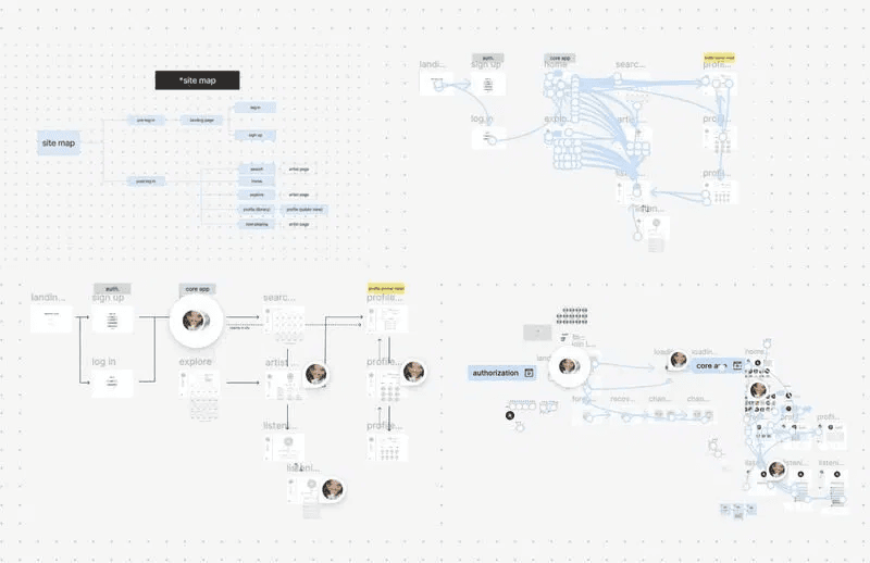
sitemap, user flows & lo-fi wireframes — figma, march 2026
Before touching hi-fi, Sarah and I mapped out the full site architecture and user flows across five core sections: auth, core app, search, artist pages, and profile.
The lo-fi pass was for getting the logic right making sure the identity-driven discovery system actually made sense as a navigation structure before we committed to visuals.

hi-fi prototype flows- the system connected so far … (mueheh)
redesigns
what changed?
identity shift, intention in interaction, and aesthetic pivot
We made an intentional shift from v1's early-2000s Macintosh look to a modernized Class Bottle Green meets 2000's CRT-inspired direction for v2. Although we really liked the scrappiness and diy look of V1- our execution gave off unpolished, rushed feel - with flat, generic UI patterns that didn't feel considered. For v2, we grounded the visual language in physical media: CRT scan lines, hardware textures, and era-specific formats that tap into real nostalgia triggers rather than a generic "retro" gesture.
That same intentionality shaped the interaction model. Instead of one generic listening experience, v2 introduces four listener archetypes — Audiophile, Explorer, Critic, and Fan with each shaping how a user discovers and engages with music.
The aesthetic pivot wasn't just cosmetic; it was in service of an identity-driven experience that reflects how people actually relate to music, rather than treating every listener the same way.
design system / style guide draft 1
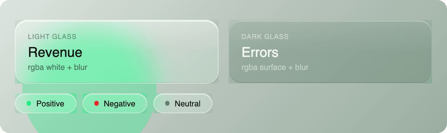
Used Claude to draft up a super diet/rough style-guide for Sarah's test visuals.
landing page
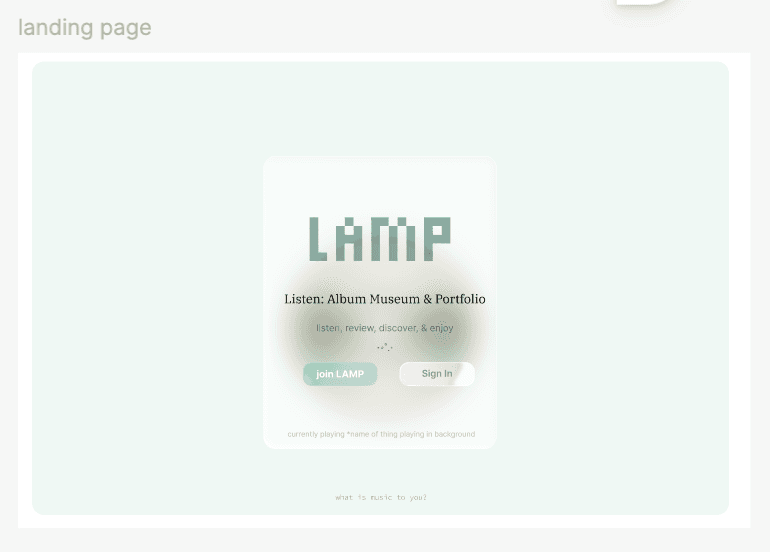
landing page (new vs old)
final version title in Coral Pixel, substitution used in Figma

explore page
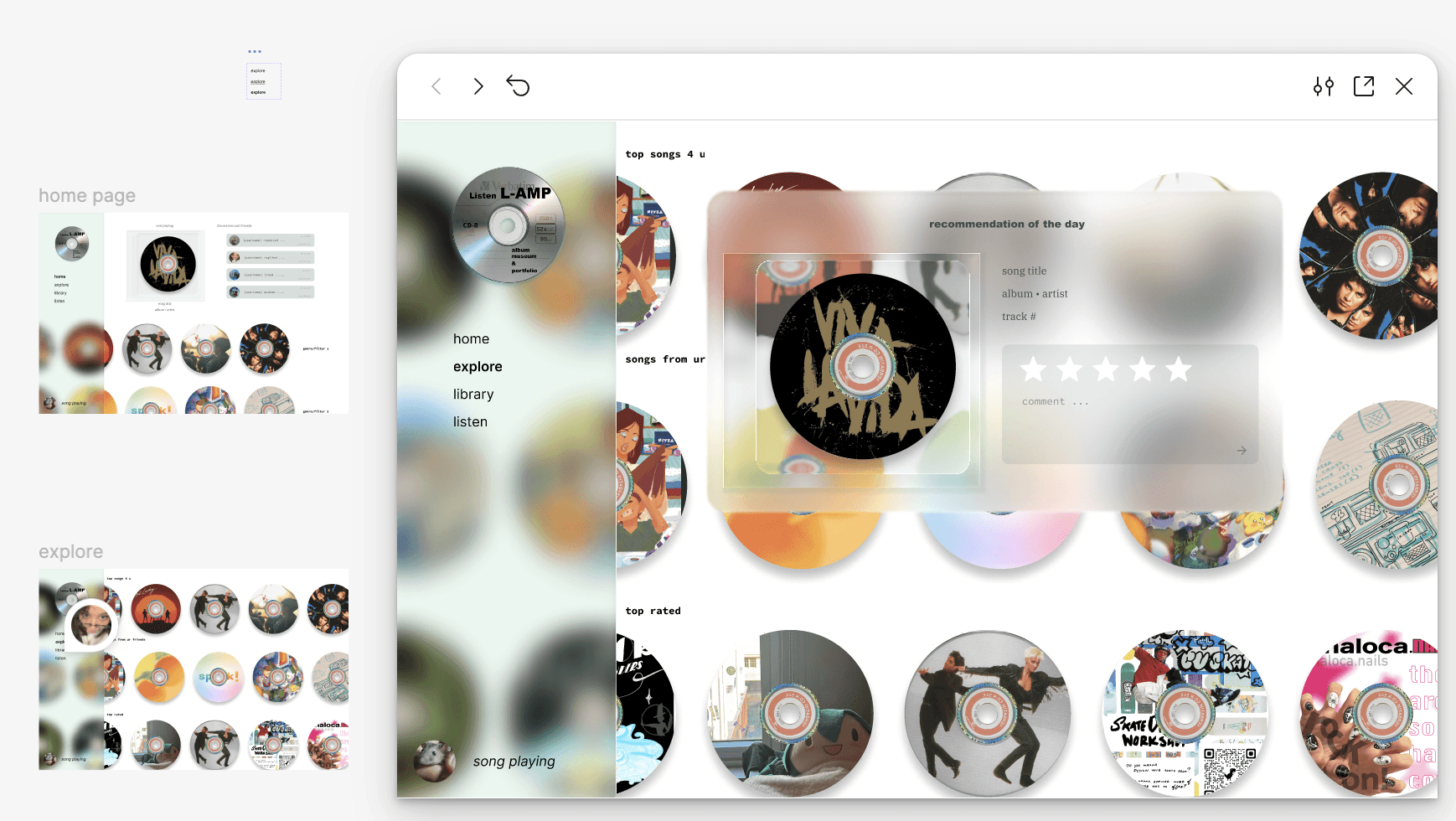
listening screen


before (week 2)

after (week 4)


canvas prototype development progress
prototype
Final Product
Puterbook is an iPad app that lets you write Python by hand and actually run it — collapsing "take notes" and "write code" into a single action instead of two separate tools.
Handwriting Canvas
An infinite, scrollable canvas built for writing code and notes the way you'd write in any notebook — pencil options, colors, and all the basics.
Color-Coded Ink
Grey ink means code, any other color means annotation — no new interaction to learn, just pick a pen color like you always would.

On-Device Recognition
Apple's Vision framework reads handwritten Python directly on the iPad — no server, no latency, no waiting on a network call.
Run & See Output
Tap run, and recognized code executes through Wandbox, with real output displayed right on the canvas — no jumping between a notes app and a separate code editor.
for the future
Reflections & What's Next
I design with a working knowledge of what's actually feasible to build. Puterbook is what happens when a self-taught illustrator learns to code and builds the notebook she wished she'd had. It's a product born from my own experience learning to code, shaped by design instincts from illustration and UX, and built end-to-end by hand.
The biggest surprise wasn't the handwriting recognition or the code/notes detection — it was how much of the build ended up depending on infrastructure outside my control. Pivoting execution APIs mid-build, from a local server to Piston to Wandbox, taught me to treat third-party dependencies as a real risk to plan around, not just an implementation detail to pick once and forget.
My vision for Puterbook's next phase is tackling a real production execution backend. While Wandbox's public API proved the core loop, it's not built for reliability or scale. Everything else (saved history, layer management) can wait; execution is the one piece the whole app depends on working.
made with love and some more fun stuff
©daisy fernandez-reyes 2026
last updated august 2026